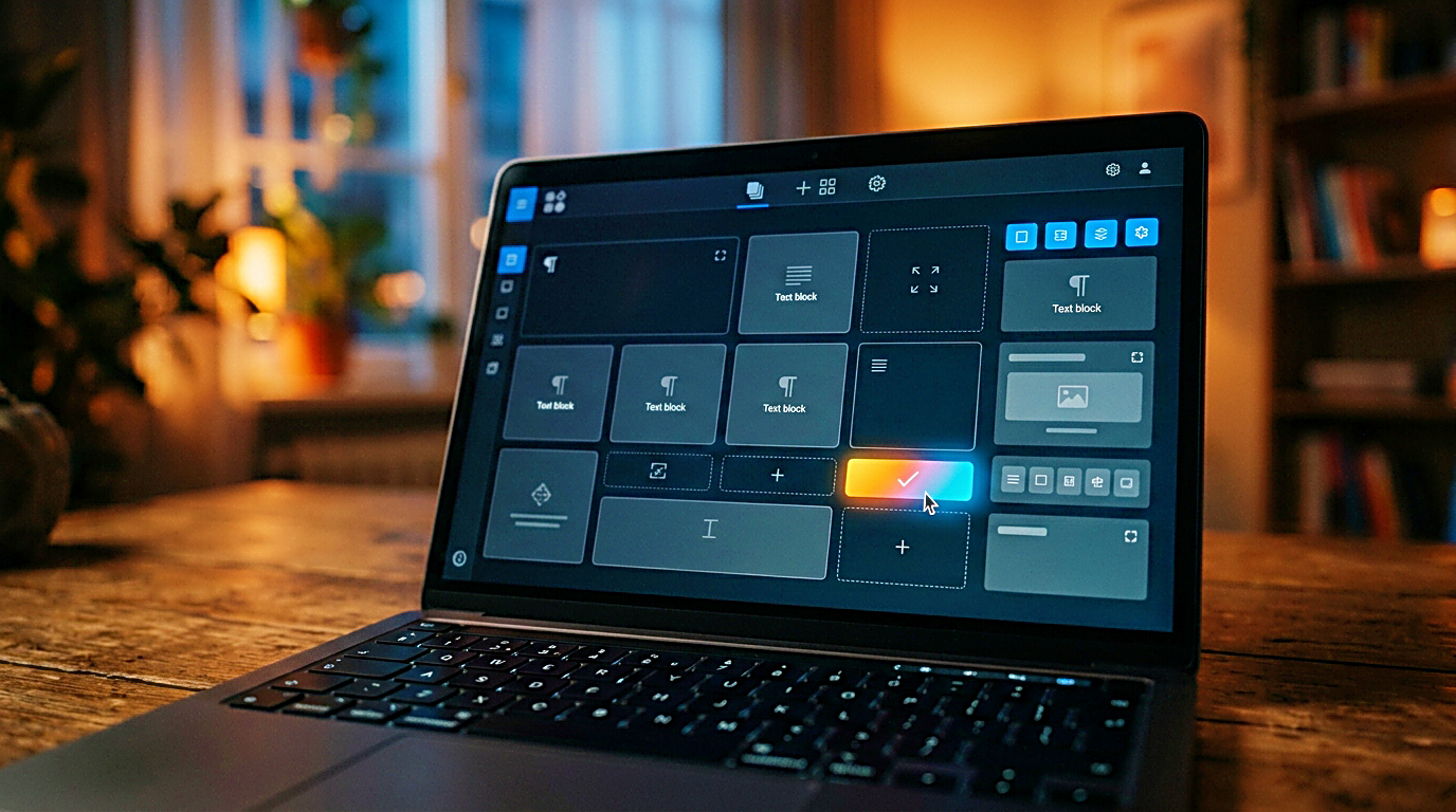
You open a web page builder, and for a short moment, everything feels solved. A hero section is already waiting for a headline. A grid of cards seems ready for products or links. A testimonial block, a footer, and a button are sitting in place, as if the page already knows what it wants to become.
Then you start typing.
That is usually when the template stops helping. The layout can make a blank page look organized, but it cannot tell you why someone would land on the page in the first place. It cannot decide whether the reader needs an explanation, a comparison, a product path, a contact option, a tool, or one clear next step.
A web page builder can make publishing easier. It should not make an unclear page look finished.
A good web page builder makes a clear page easier to publish. It should never replace the decision behind the page.
That distinction matters for solo creators. A larger company may have a design team, a brand system, a copywriter, and a funnel strategy behind every page. A small creator often has one screen, one tool, and a page that needs to become useful without becoming noisy. In that situation, the builder can help, but only after the page has a job.

A good looking page can still have no job
The easiest trap inside a website builder is visual progress. Moving blocks around feels productive. Swapping fonts feels like branding. Changing a button color feels like conversion work. The page visibly improves, so it is easy to mistake movement for direction.
But a polished page can still fail.
If a visitor cannot tell what the page is for, the design is not carrying much weight. A vague headline, a button with no clear reason to be clicked, and sections that do not build toward anything can turn a clean layout into decoration with navigation.
A homepage has a different job from a landing page. A landing page has a different job from a blog post. A buying guide has a different job from a contact page. When every page is built from the same visual habit, the site may look consistent while still feeling unfocused.
Before choosing a template, the creator needs to answer one question clearly.
What should this exact page help the reader do?
That question does more work than most layout choices. A page meant to help someone compare options needs a different rhythm from a page meant to introduce a brand. A page meant to send people toward a tool needs less friction. A page meant to earn trust before an affiliate link needs more context before the click.
The builder should follow that answer. It should not be the thing deciding it.
Templates work best after the reader path is clear
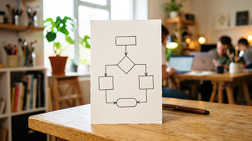
A template becomes useful when the reader path is already visible. Without that path, every section in the builder looks reasonable. With it, many sections become unnecessary.
The reader path is the order of understanding. It begins with why someone arrived, then moves through what they need to know, what they might doubt, and what action makes sense next.
A creator building a buying guide page with a landing page builder does not only need a clean product grid. The reader may first need to understand what kind of products belong on the page. Then they may need categories, a few featured picks, links to deeper guides, and a plain disclosure. The template earns its place only if it supports that order.
A tool page needs a different path. The reader should understand what the tool does, use it without friction, and know where to go afterward. Too many decorative sections can bury the thing people came to use.
An income or monetization page needs even more restraint. It should not read like a promise of easy money. It should explain the model, the limits, and the next small step with enough clarity that the reader does not feel pushed.
The same web page builder can support all of these pages, but the structure should not be copied blindly. The page type decides the structure. The template is only a starting shape.

The builder should reduce decisions, not multiply them
A web page builder exists to make publishing easier. In practice, it can quietly create more decisions than a creator needs.
Templates, blocks, columns, animations, font pairings, spacing controls, mobile settings, popups, forms, and color options all look small by themselves. Together, they can take over an afternoon before the page has said anything useful.
This is especially easy when someone is building alone. Design decisions often feel safer than content decisions. Adjusting a button radius feels controlled. Choosing a slightly different layout feels productive. Deciding what the page is actually asking the reader to do feels more exposed.
That does not mean design is unimportant. It means design has an order.
Start with the page purpose. Then write the core message. Then outline the section flow. Only after that should the template be chosen. If the builder makes the structure harder to explain, it may be the wrong template for that page even if the builder itself is good.
A quiet page with an obvious path is usually stronger than a busy page built on no real decision.

Choose the builder for the site you are actually running
Not every creator needs the same web page builder. Some need one simple landing page. Some need a blog-centered website. Some need affiliate product cards, comparison sections, disclosure blocks, and category hubs. Some need forms, downloads, member pages, or lightweight tools.
The problem begins when a tool is chosen because the demo looks impressive, not because the website needs that kind of system.
A portfolio site needs visual polish. A content site needs stable article templates, category paths, internal linking, and pages that load without constant attention. An affiliate site needs comparison logic, buying criteria, and enough room to explain trust. A small landing page needs one clear action and very little competing with it.
Those are different needs.
Before comparing feature lists, list the recurring page types the site will actually use. For a creator website, that may include a homepage, category hub pages, article pages, buying guide pages, disclosure pages, a contact page, and one or two tool pages. If a website builder handles those pages well, it may already be enough.
The best builder is not always the one with the most design freedom. Often, it is the one that stays easy to maintain after the first week of excitement is gone.
A free site builder, a hosted website builder, a no code website builder, and a more flexible WordPress setup can all be reasonable choices in different situations. The question is not which one looks most powerful. The question is which one fits the pages the creator will actually keep updating.

A page builder cannot rescue unclear content
A web page builder can make content easier to place, but it cannot make unclear content useful. If the message is vague, a better layout only makes the vagueness look cleaner.
This happens often on creator websites. A homepage says it helps people work better, create faster, earn more, or stay focused, but it never narrows the promise. The sections look complete. The reader still does not know what the site is actually for.
The fix is not another template. It is a sharper page promise.
For a homepage, that might mean naming the decisions the site helps solo creators make, such as tools, workflows, buying choices, or income paths. For a buying guide page, it might mean naming the real work condition someone should check before buying. For a creator tools page, it might mean helping people decide before they add another app or subscription.
Once the promise is specific, the builder becomes useful again. The headline knows what to say. The sections know what they are supporting. The button knows where it should send the reader.
Without that promise, every layout choice is just a guess with better spacing.

Treat the template as a draft, not a rule
Templates are not the problem. They reduce the pressure of an empty page, and that can be genuinely useful. The mistake is treating every section that comes with the template as something the page must keep.
A template might include testimonials before the site has social proof worth showing. It might include pricing tables when nothing is being sold. It might place a large image section where the reader actually needs a plain explanation first. It might place a call to action before anyone understands why clicking matters.
A creator should feel free to remove sections.
In many cases, the strongest page has fewer parts. One clear headline, a short explanation, a logical section order, a few links that earn their place, and one next action can do more than a long page filled with blocks that only exist because the template included them.
A section should stay when it answers a real reader doubt. If it is only there because the design looked complete with it, it should be questioned.

Build for the update, not only the launch
A page that looks good on launch day can become a problem later if updating it is difficult. For creator sites, this is not a small issue. The content grows, the categories shift, the links change, and the page has to keep working.
A buying guide page may need new product groups over time. A creator tools page may need updated links. An income page may need clearer disclosures. A homepage may need to feature new categories without a full rebuild. A tool page may need a cleaner path once more related posts exist.
The builder should make those updates simple.
A good page structure is not only attractive. It is repeatable. The creator should be able to add one more card, swap one featured link, or update one section without breaking the page around it.
That is another reason to be careful with templates that look impressive in a demo. The more elaborate the layout, the more fragile it can become when one person has to maintain it alone. For a solo creator, maintainability is part of design.
The right web page builder should save attention later. It should not borrow attention now just to look polished.

A quieter way to build the next page
A web page builder is useful when it supports a decision that has already been made. It can speed up layout work, reduce technical friction, and make publishing feel less intimidating than starting from raw code. But it works best after the page purpose is clear, not before.
Before choosing a template, name the page’s one job. Before adding sections, map the order the reader needs. Before touching the design details, write the promise in one sentence. Before upgrading to a more powerful builder, check whether the one already in front of you can support the pages the site truly needs.
The best page does not begin with a template.
It begins with one question.
What should this page help the reader do?
Answer that first, and the builder becomes a tool again. Not the strategy, not the voice of the website, and not the thing that decides what the page is for. Just the place where a clear decision becomes visible.
Related FAQ
Decide the page job first. landing page builder works best when it supports a clear reader path instead of becoming another checklist with no publishing decision behind it.
Decide the page job first. affiliate disclosure page works best when it supports a clear reader path instead of becoming another checklist with no publishing decision behind it.
web page builder helps when it makes the next article easier to plan, publish, or connect internally. The value is not the tool itself, but the clarity it adds to the site structure.
The common mistake is treating old page cleanup as a shortcut. It should clarify the promise of the page, not replace the work of understanding what the reader came to solve.
It belongs where it strengthens the site path. For CalmSori, that means creator tools, workflow, publishing decisions, and links that help the reader move to the next useful page.
Before You Go
Paid links- Advertisement -