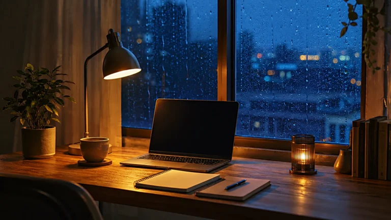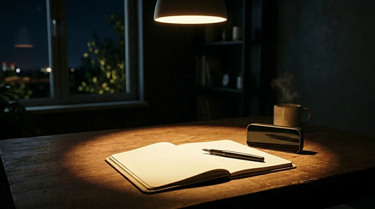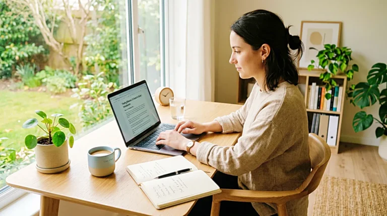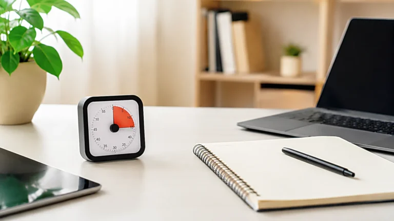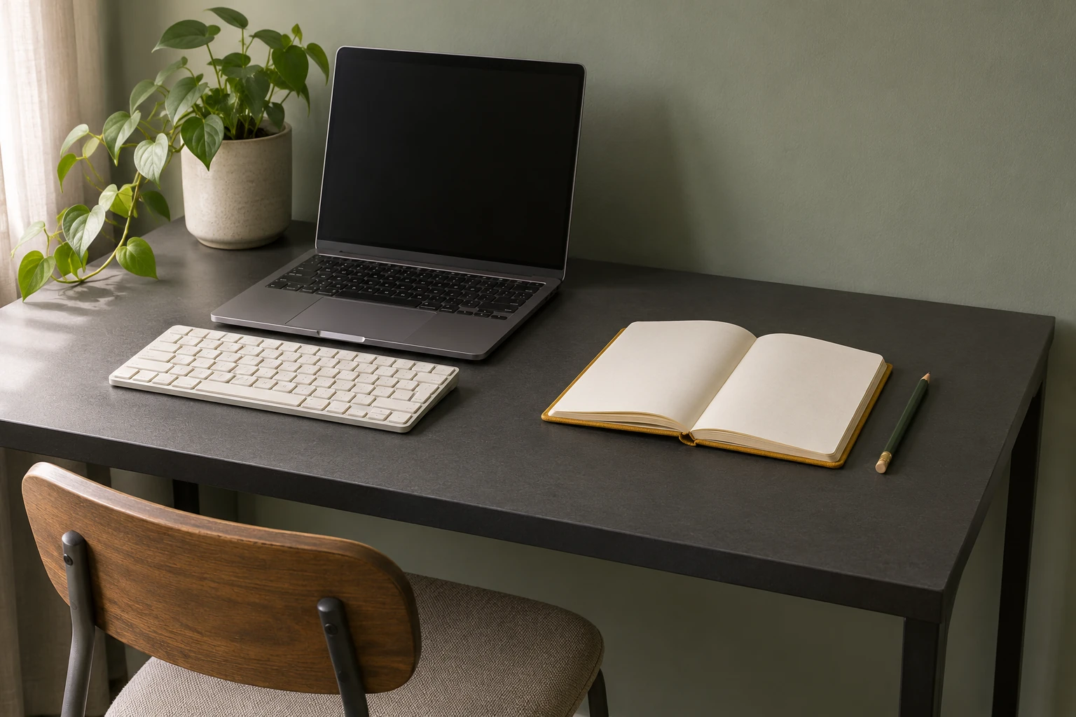
You bring a handful of desk photos into a draft and realize none of them shows whether a notebook can open beside the laptop. For a small desk setup guide, plan one wide photo to show how the space fits together, then a placement detail and a photo of the setup in use. Decide what each frame needs to show before picking up your phone. That gives you a way to check the set while the desk is still in place.
What should the photos help a reader decide?
Write down the question your guide answers. If it’s about keeping a place to write beside a laptop, the reader needs to see where the notebook goes and whether there’s room to write with it open. Set up the desk the way you use it for that task. Leave the keyboard or mouse on the desk if it usually stays there.
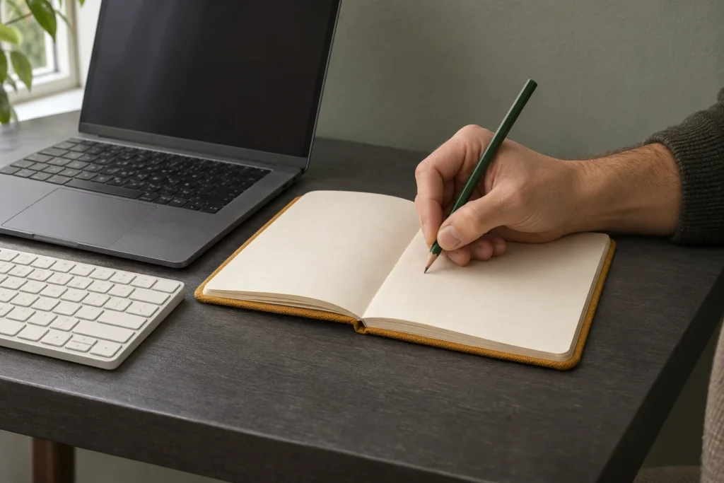
In a note on your phone, give each frame a job. The wide photo shows the laptop and writing space together. The placement detail shows how the open notebook sits in relation to the keyboard and the front edge. The photo of the desk in use shows where your forearm rests when you pick up the pencil.
Read that list against the headings in your draft. If the article also says you can reach the mouse without moving the notebook, either plan a frame that shows the reach or narrow the claim to the writing space. You can settle that before you start shooting.
Where can you show the whole layout?
Start near a front corner and look across the desk with your phone. For the laptop and notebook example, keep the laptop, the whole open notebook, and the front edge in the same frame. Show enough of the side edge to make it clear how much desk the notebook takes up. Stand back where you can and try a slightly higher angle if the laptop hides the surface behind it.
If you can only shoot from one side, raise or lower the phone and watch what disappears behind the foreground objects. Keep the angle that reveals the usable surface. For a guide about working in a tight nook, include the wall or furniture that limits the layout. For a guide about switching between typing and writing, use that space in the frame to show where your chair sits.
Take the wide shot first and leave it on your phone as a reference. Before changing angles, note where a couple of objects line up against the desk edge. Those landmarks help you spot anything you’ve nudged while taking the closer photos.
Which details show placement and use?
Move closer for the placement photo. Keep the notebook edge, a visible part of the keyboard, and a strip of desktop between them. A reader can see how the two fit without searching for the same corner in the wide photo. If your guide depends on a specific clearance, note the measurement on your desk and put it in the article. The angle of a photo alone can make a gap look wider than it is.
Use that same layout for the next photo. Sit where you usually work, open the notebook, and see where your forearm and elbow settle. If you’re shooting alone, hold the phone in your free hand and brace that elbow against your side. Keep the writing hand and the front edge of the desk in view. An image of a hand on the pencil is easier to interpret when the reader can see where the arm is supported.
For a guide about a laptop cable you unplug every day, the same pair of photos would show the connector at its resting point and your hand reaching it from your chair. Keep a corner of the laptop or a desk edge in both shots so the location stays clear.
What should you check before clearing the desk?
Open the photos in order and view them at about the width they’ll appear on a phone. Check that the whole layout is easy to place, the detail shows which objects sit next to each other, and the use photo shows the part of the movement you describe. If the pencil tip or the desk edge vanishes in the crop, take a slightly wider version while everything is still set up.
Keep the frames that answer those questions beside the draft. As you work through your publishing checklist, describe what’s visible in the alt text. For the use photo, that might be a hand holding a pencil over an open notebook beside the laptop.
Related FAQ
It matters because a post can look complete while still missing its job. thin content check helps check whether the article actually gives the reader a reason to keep reading.
Keep it tied to one decision. If brand voice guide produces too many options, narrow the list by category, reader intent, and whether the site can answer the topic with authority.
Keep it tied to one decision. If article angle produces too many options, narrow the list by category, reader intent, and whether the site can answer the topic with authority.
It matters because a post can look complete while still missing its job. publishing cadence helps check whether the article actually gives the reader a reason to keep reading.
Keep it tied to one decision. If about page message produces too many options, narrow the list by category, reader intent, and whether the site can answer the topic with authority.
Before You Go
Paid links- Advertisement -